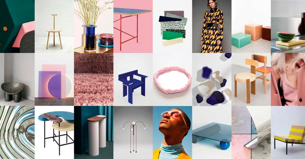
In the past year, we have witnessed a transformation that has closed the gap between art and design. We asked furniture and interior designer Sara Martinsen to explain what this means for the furniture world and interior design trends in general.
In the design world, there is no doubt that the fashion industry always sets the trends. Both established and up-and-coming fashion brands are leading the way, introducing new looks that have a powerful impact and quickly catch on.
In the part of industry I work with – furniture and interior design – things (luckily) don’t move quite so fast.
A piece of furniture will always be a long-term investment compared to a blouse or a pair of trousers, and for that reason, furniture and product design will never be as trend-based as fashion. Of course fashion influences the furniture industry through colours, materials, patterns and shapes, but it is individual elements that are brought into play rather than the entire palette.
In search of something unique
Together with fashion, social media also have an influence, and in a world where we are bombarded by impressions, the search for something unique and daring has long characterised interior design.
The individual and distinct look that stands out from all the other visual impressions and makes people take notice. We used to call it a “photogenic detail”. Now it’s an “Instagram moment”.
This is where the minimalist furniture world often can’t keep up. However, in the past couple of years, we have seen a shift in which art and design have grown closer. This creates a space in which the design world can be more conceptual and challenge boundaries while giving art a larger audience and more than merely a visual function.
This is the focus of this blog post.
From financial crisis to a minimalist, artistic idiom
Dutch company Droog was founded in the mid-1990s, followed by the Mooi brand with Marcel Wanders at the helm. Both companies took a humoristic and artistic approach to design and sought to push boundaries, but their approach never became more than a niche concept.
Around the millennium, the interior design industry also began to challenge norms with doubly curved surfaces, carbon and injection moulding manufacturing techniques. The result wasn’t always pretty and at times it diverged quite significantly from the minimalist Scandinavian look. We all talked about reinventing the Scandinavian style and stood on the shoulders of our forefathers, but we had only just begun playing with the idea when the financial crisis hit.
Both during and after the crisis, manufacturing companies became almost dormant. Very few products were launched and we seemed to have a period of spring cleaning in the design world. After a period in which we mulled things over and cleaned house, there followed a period dominated by simplified and minimalist shapes.
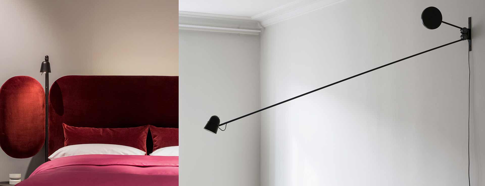
Eight years have now passed since Daniel Rybakken presented his beautiful light installations and sculptural lamps. His simple geometric shapes are an excellent example of the style that immediately followed the financial crisis. Perhaps his simple idiom was bold in a liberating way after a tough financial crisis and a period with overly designed products. Major brands welcomed him into the fold and so the artistic also became commercial and more accessible.
Products as art
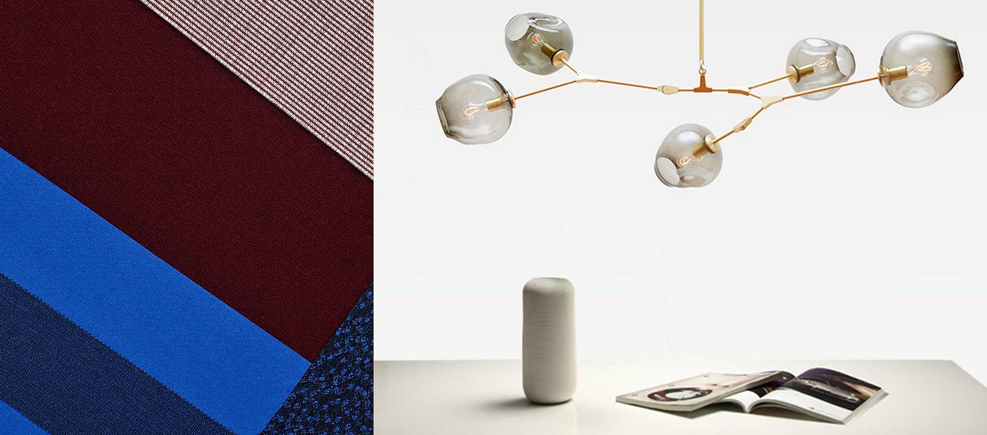
Since 2010, the influence of art on the design industry has only become more apparent. Lighting designers Michael Anastassiades and Lindsey Adelman really took the industry and the press by storm. Lighting companies, like Italian Flos, Swedish Wastberg, American Apparatus and Roll & Hill have all had great success with their sculptural products.
The British designer Faye Toogood speaks of having the courage to bring art and craftsmanship back to the furniture industry. Along with Italian duo Formafantasma, she is trend-setting at the crossroads of art and design. The fact that products from Toogood are on exhibition in galleries like Dimore Gallery and Nilufar and sold at the same time by Please Wait To Be Seated makes her art more accessible and widely distributed. This is why we are seeing more interior design projects making use of art.
Art can add an extra layer of personality, character and history to an interior design and help do what is so very difficult to master among millions of impressions: capture our attention.
In Denmark, the Etage Projects gallery is attracting a great deal of attention and Kvadrat is a powerful catalyst for the meeting of art and design when they invite artists to work with their furniture textiles. Kvadrat may also be the company that does the best job transferring fashion trends to the furniture industry with the exclusive upholstery textiles developed by Raf Simons.
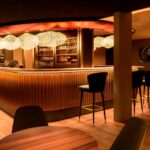
Unique hotel interiors
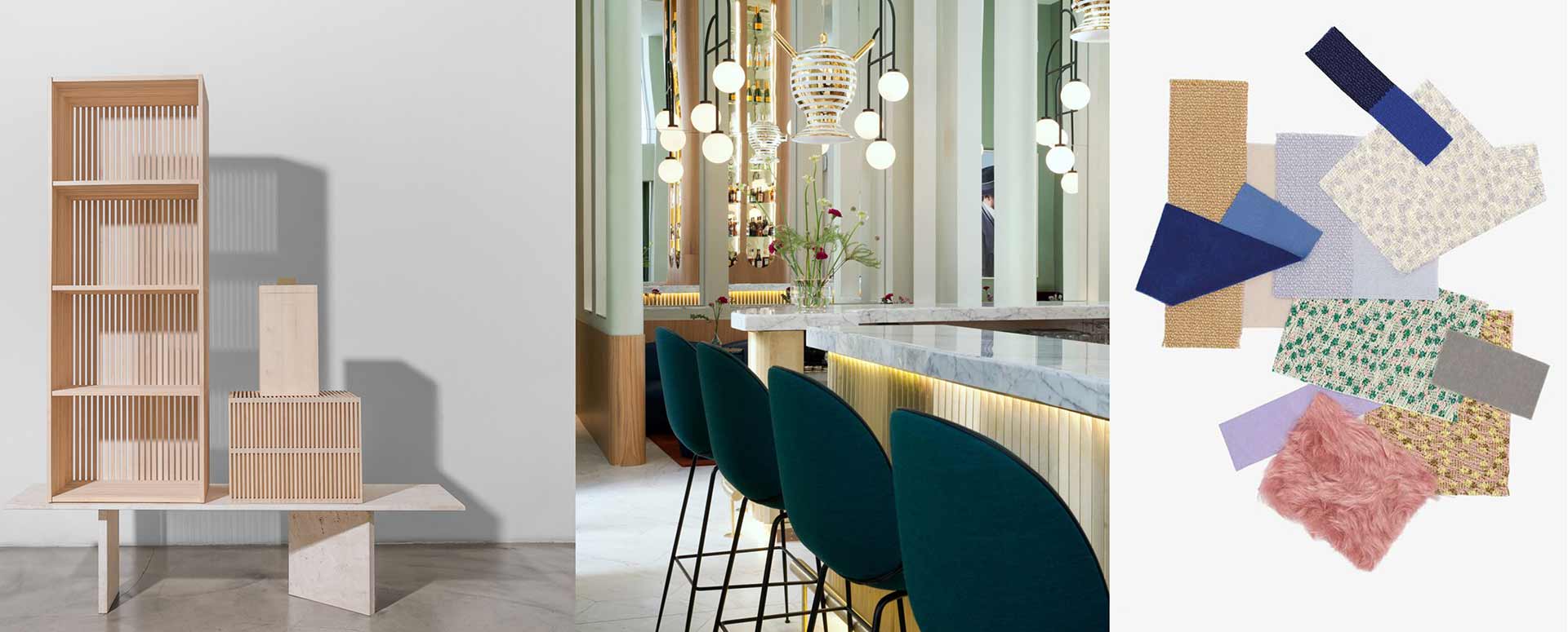
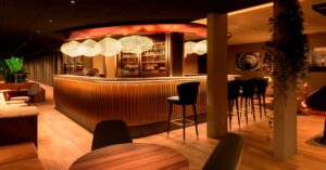
Two Danish furniture brands, Gubi and &Tradition, have, despite their Nordic roots, a more international look that appeals to the hospitality market.
There was once a huge difference between the contract market (including hospitality) and the private market in terms of design. The contract market was characterised by furniture designed to withstand wear and tear and temporary stays, whereas the private market focused more on the details, materials and personality.
However, interior designers who work with hotels and restaurants have been designing with homeliness for years now. Embracing a weight and a choice of colours and materials that were once difficult to find in the contract market.
And it has proven to be a good business strategy to differentiate themselves as a Scandinavian design firm the way &Tradition and Gubi have done. It is a good idea because interior designers use the more artistic furniture to give a hotel or restaurant a personality that appeals to everyone.
Everyone wants to share their travel experiences on social media, and this is the clear advantage of the more artistic furnishings and designs – it is easier to create photogenic smartphone moments.
The customised product embodies a dedication that is difficult to compete with. People have always been fascinated by the unique. It is exclusive, bold and inspiring and in a world where everyone – companies as well as individuals – is embracing individualism, it is a strong commodity that has come to stay.
Photo credits:
Kvadrat, Faye Too Good Studio, &Tradition, Etage Projects, Please Wait To Be Seated, Hay Design, Nilufar Gallery, Lindsey Adelman, Daniel Rybakken, Luceplan, Studio Formafantasma, Gubi, Michael Anastassiades Design, Hotel Barcleó Torre De Madrid, Artek, Office Magazine.
